Beginning a New Adobe Spark Posts Graphic Project
To begin creating with adobe spark, head over to spark.adobe.com and either create or log-into an existing account. CSUCI faculty, students and staff can use their school enterprise accounts to sign into Adobe Spark to gain access to their provided Premium accounts. Once you have logged in, you will be taken to your account homepage.
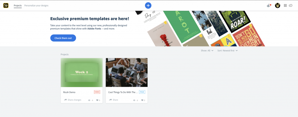

To create a new project, click on the “+” button at the top center of the page, this will take you to the Spark Templates page.
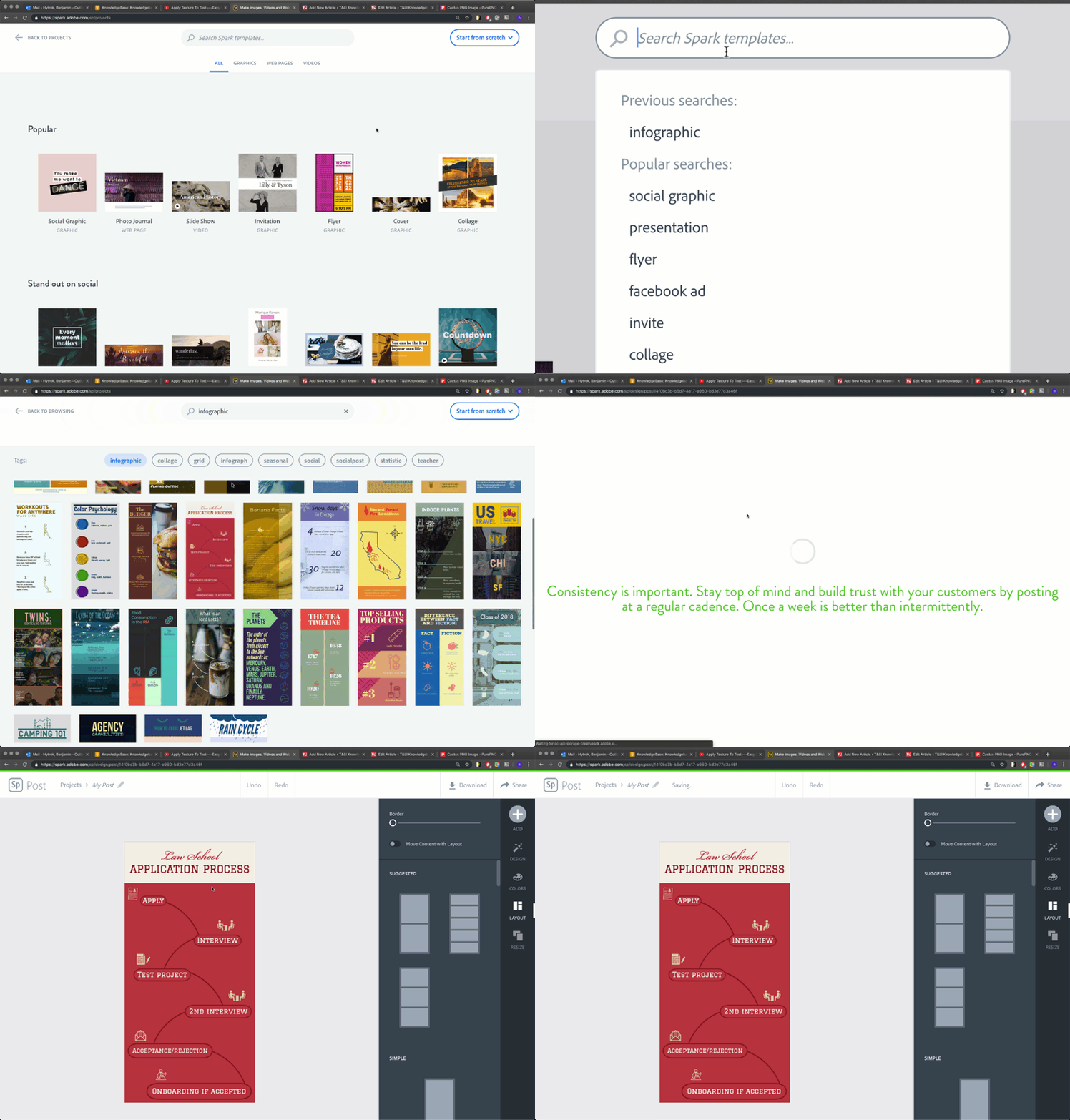
On the Spark Templates page, you will see that templates for projects are broken out into project types tabs; “All”, “Graphics”, “Web Pages” and “Videos”. Navigate to the “Graphics” tab at the top center of the screen if you wish to use a pre-made template for your video project. If you wish to refine your template search, use the search bar at the top of the Spark Templates page to type in a type of project like “presentation”, “infographic”, “social media post”, etc. If you wish to start with a blank project, navigate to the “Start from scratch” button on the top left hand side of the page and choose “Graphic” from the dropdown menu.

Using Spark Templates to Create Pre-formatted Graphics
For the purpose of this guide, let’s try searching for a “infographic” template. Start by typing in “infographic” into the search bar at the top center of the Spark Template page. This will pull up all of the pre-formatted templates Adobe Spark has for infographics. You can scroll through the template selection and find a template you wish to use. Once you have found the right template, hover your mouse over the preview image of the template and click on the “Create from” button that appears on the template to load the design into the Spark Post Editor.
Using the Spark Post Editor
Adobe Spark graphics created int the Spark Post Editor and are made by layering different pieces of media like shapes, images, and text on-top of a blank canvas, just like you would in other graphic editors such as Adobe Photoshop or Illustrator.
The Canvas
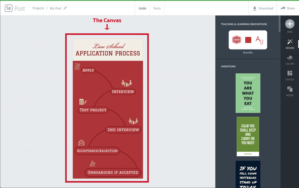
The Canvas is the large area in the middle of the Spark Post Editor where you can design and preview your graphic. Everything you see in your Canvas is what will end up as your final graphic design. By default, the Canvas is sized to specific dimensions either pre-determined by the template you are using, or a custom dimension you set when you first created a blank project. You can change the size of your Canvas at any time by navigating to the “Resize” tab.
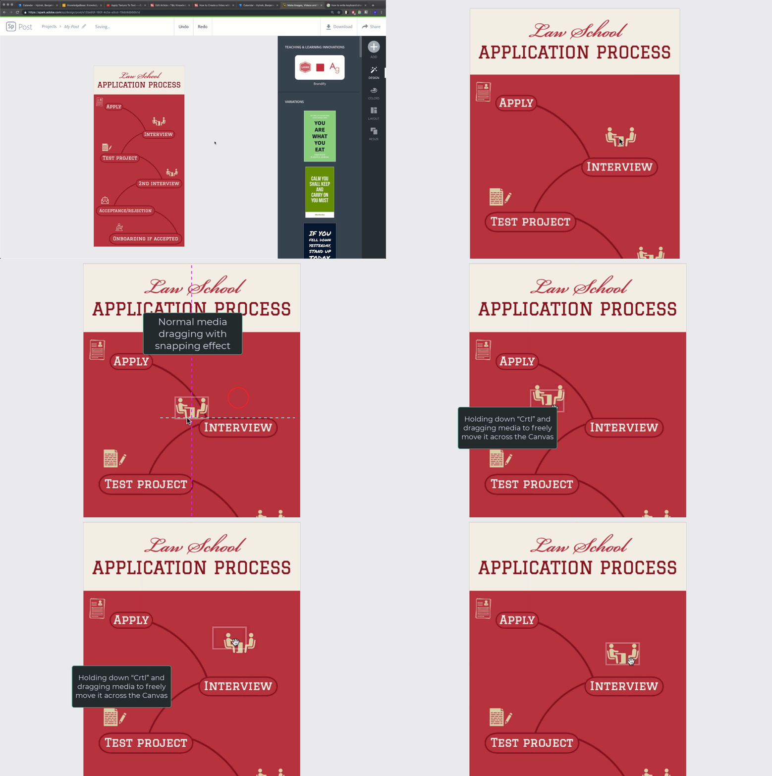
You can drag and rearrange media on the Canvas by clicking and dragging it into the appropriate position for your design. Dotted lines will appear that will align or “snap” the media you are dragging to other pieces of media in the Canvas, this is done to help you align your media symmetrically. If you do not wish to have your media aligned using “snapping”, you can hold down the “Ctrl” key on your keyboard when you are dragging to freely move media across the Canvas.
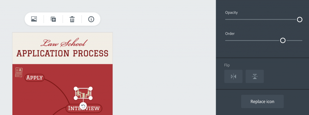
You can edit the parameters of individual pieces of media on your Canvas by doing a single left click on the media you want to edit, bringing up its media controls.
The Add Button
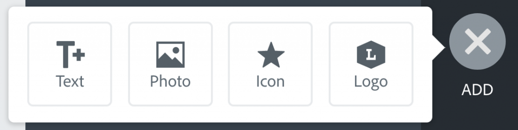
The Add Button located on the top right of the Spark Post Editor allows you to import new pieces of media such as text, photos, icons, and branding logos to the Canvas either from your computer or from the graphical resources that Adobe Spark provides.
To begin adding new media to your Canvas, click on the Add Button, this will reveal the Add Button Menu and show you the types of media you can import into your graphic project.
Types of Media and Their Controls in Adobe Spark Post Graphics
Text
You can add text to anywhere in your graphic by clicking on the “Text” Button in the Add Button Menu. This will pull up a dialogue window where you can type in the new text you want to include. When you are done typing the text, hit the “Done” button in the dialogue window to place the text into the graphic. The text will insert itself reformatted to whatever theme you have set for your graphic project.

Modifying Text
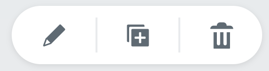
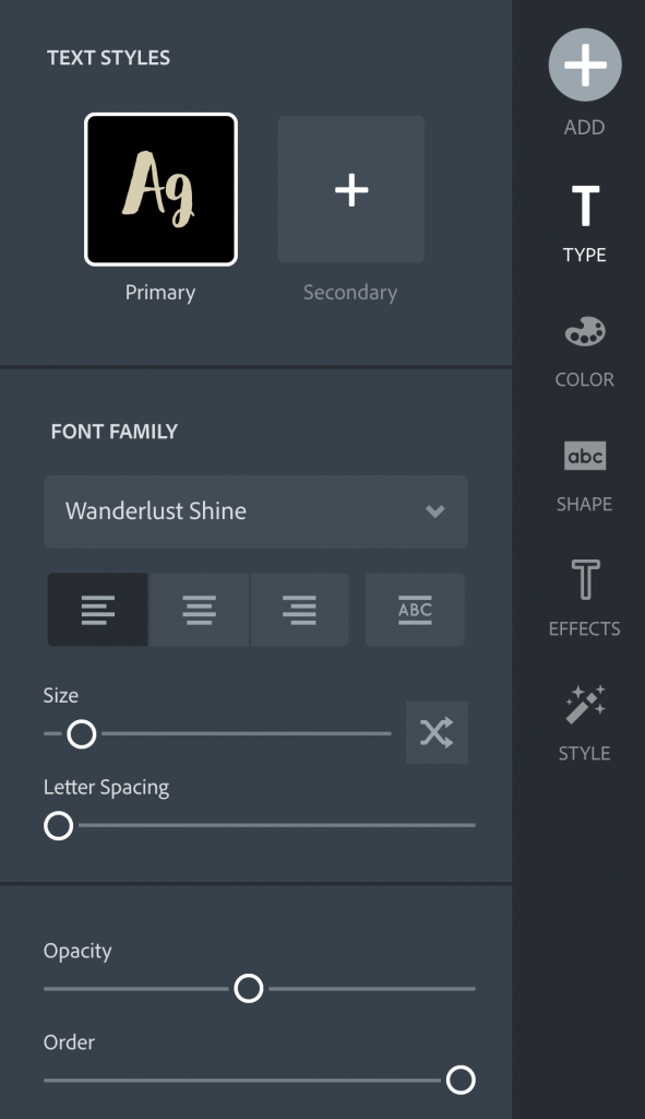
You can left click on text in the Canvas to modify its properties. Once a piece of text is selected in the Canvas, a property modifier panel will display above the Canvas and the Property Modifier Tabs will replace the normal Styles Tabs on the right hand side of the Spark Post Editor. From these controls you can change, move, and stylize the text layer to best suit your project.

Photos

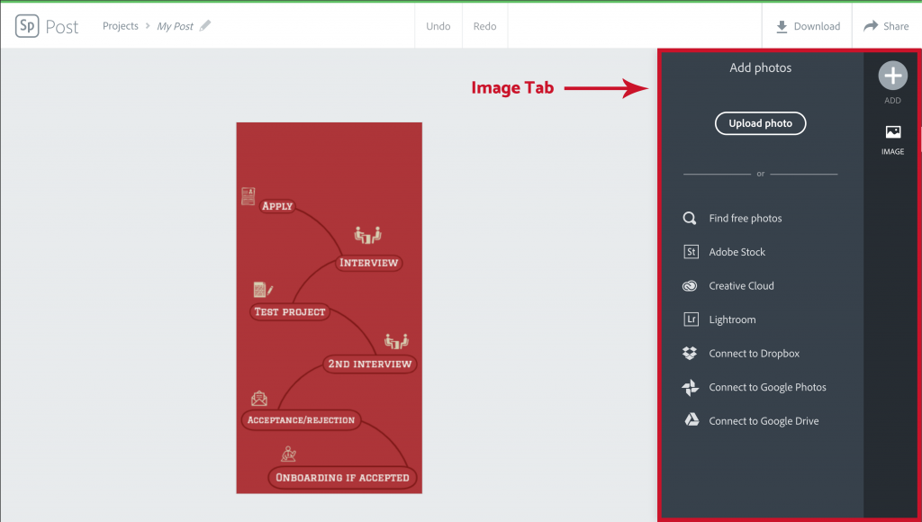
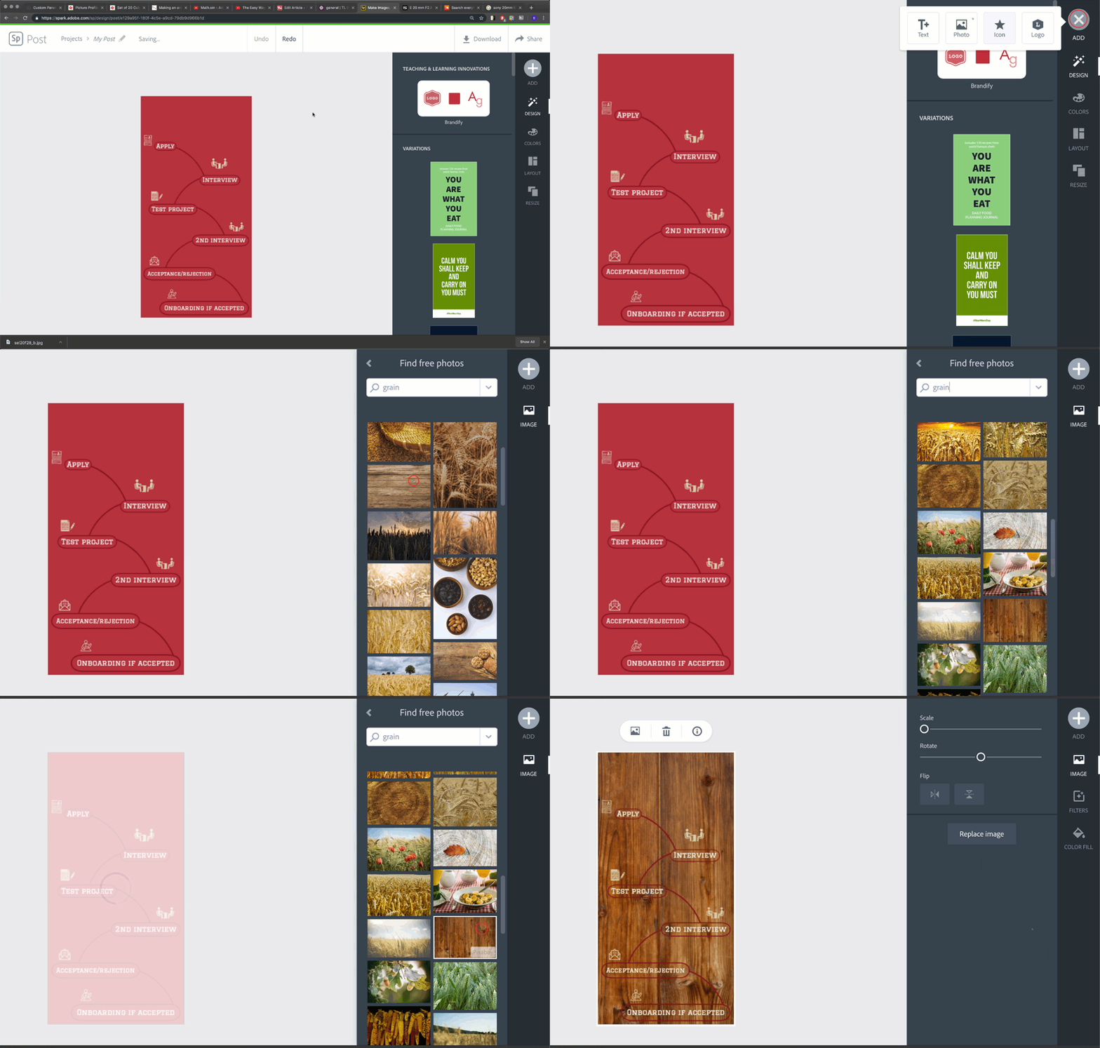
You can add a photo in your graphic by clicking on the “Photo” Button in the Add Button Menu. The Styles Tabs will drop away reveal the “Image” Tab that will allow you to select wether you want to add a photo from your computer, or find a photo from one of the various integrated photo services that Adobe Spark offers.
Modifying Photos
Photo modification options depend on what kind of template and layout your started your graphic project with. If your layout or template does not have preexisting photo boxes, adding a photo will apply the new photo as a background to the graphic.
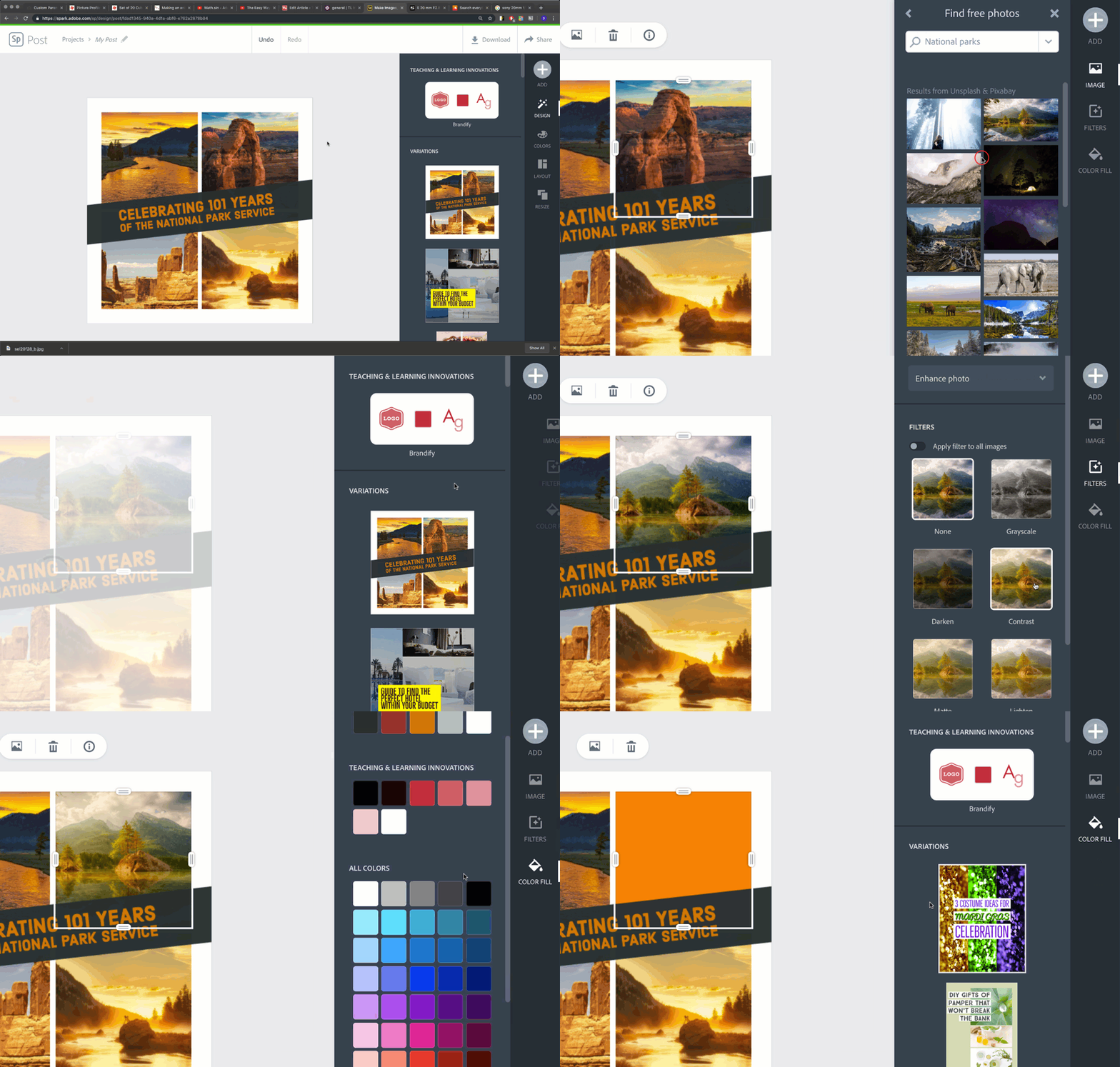
If your layout or template does have preexisting photo boxes, you can click on the box to add, replace, or delete an image as well as bring up some Property Modifier Tabs to scale the image, add filters, or even replace the picture with a solid color.
Icons
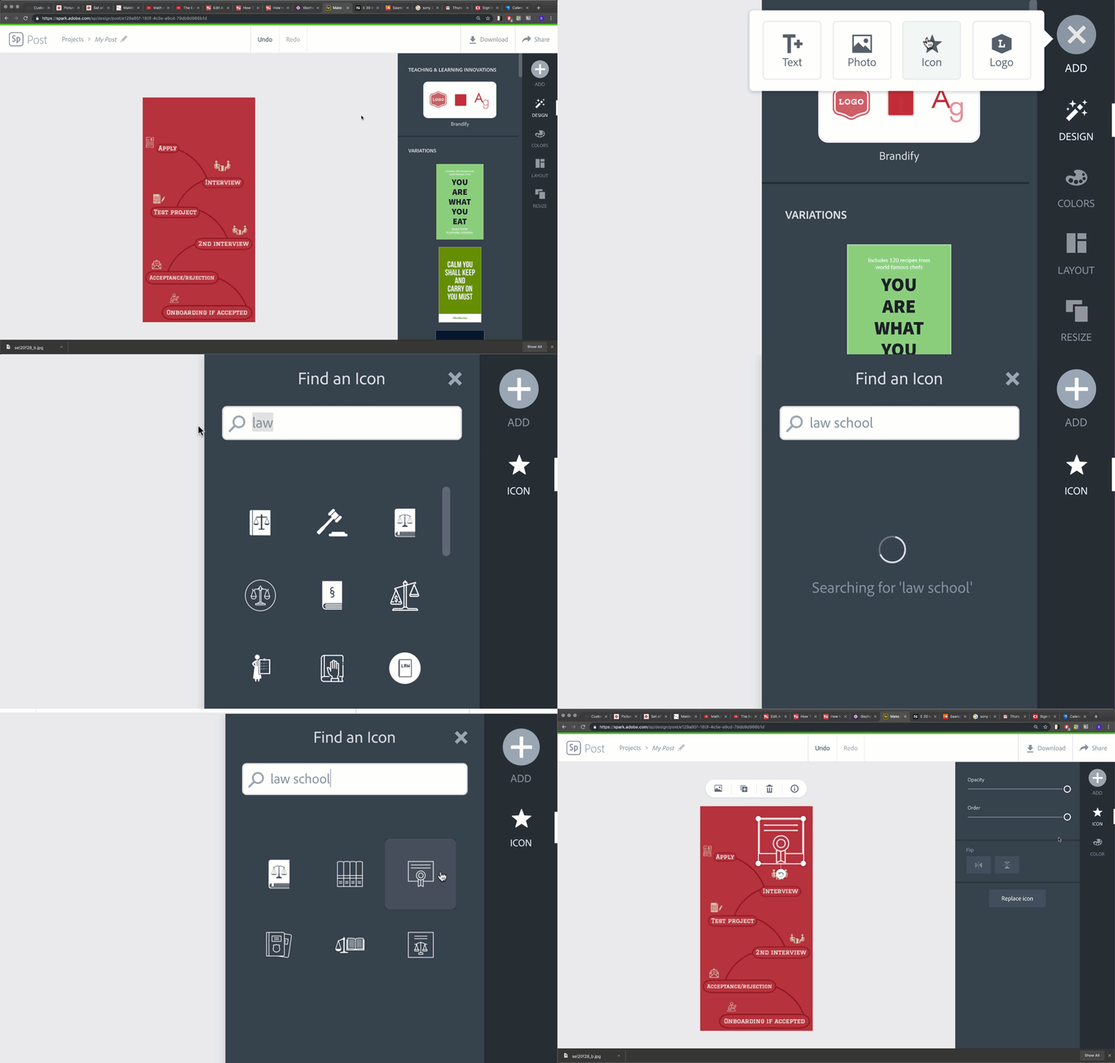
Icons are sets of pictures that Adobe Spark provides to add graphic projects without having to worry about copyright infringement. You can add a photo in your graphic by clicking on the “Icon” Button in the Add Button Menu. You can use the search bar in the “Icon” Tab that replaces the Styles Tabs on the right hand side of the Spark Post Editor to find different kinds of icons based on search terms. Clicking on an icon in the Icon Tab will add it to your Canvas.
Modifying Icons
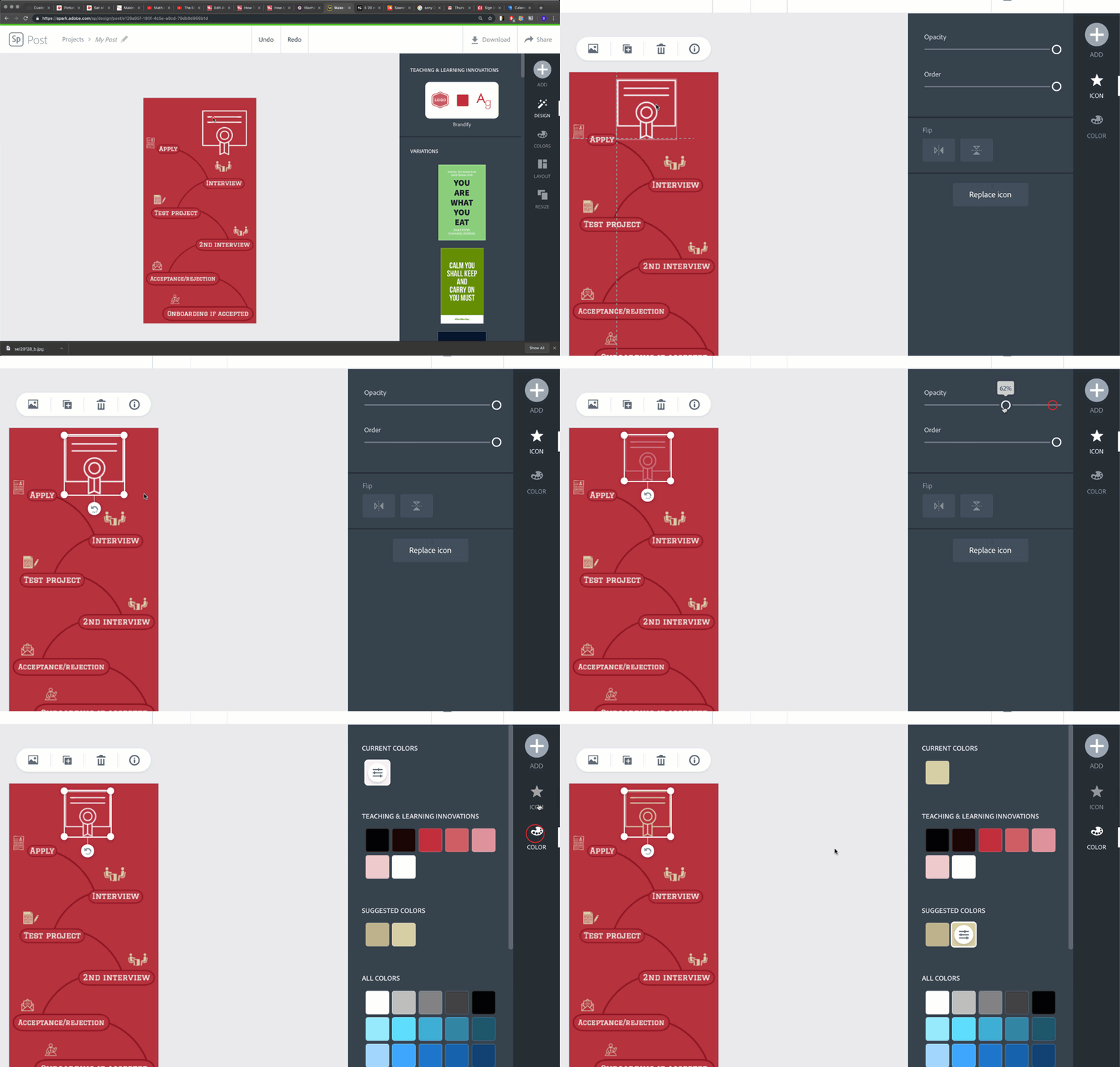
Unlike photos, icons can be freely added and moved across the Canvas regardless of template or layout of the graphic project. You can click on an icon in your Canvas to bring up Property Modifier Tabs to resize, replace, or change the color or opacity of the icon.
Logos
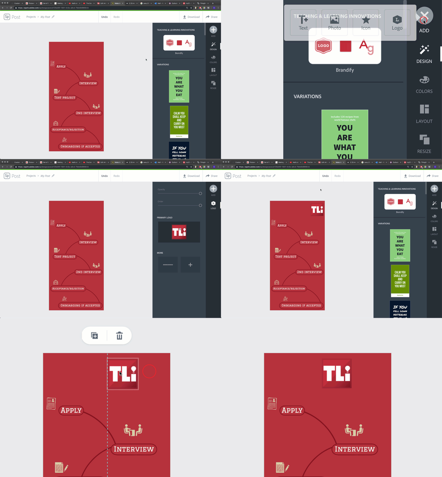
If you have created a brand within Adobe Spark, you can automatically ad your logo to any Spark Post graphic project by clicking on the “Logo” button.
Modifying Logos
You can click on your logo in your Canvas to bring up Property Modifier Tabs to resize, replace, or change the opacity of the logo. Logos can also be freely moved across the Canvas just like icons or text.
The Styles Tabs
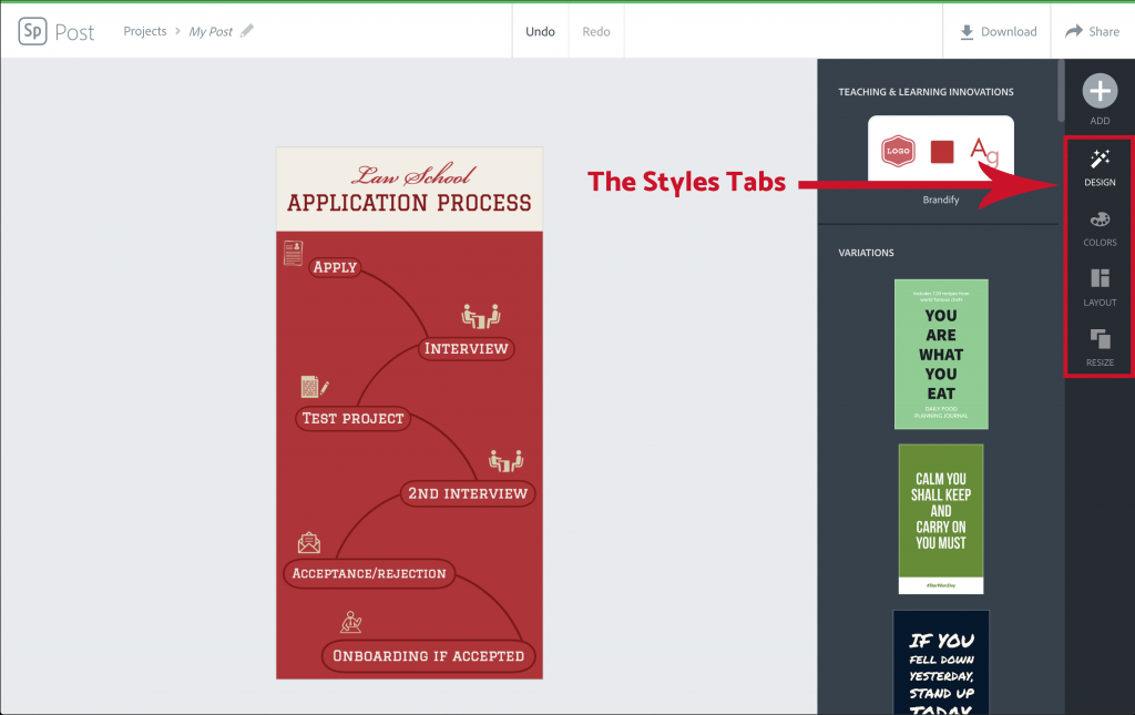
The Style Tabs on the right hand side of the Spark Post Editor allow you to change the look and feel of your entire graphic project. These tabs are broken up into; the “Design” Tab, the “Colors” Tab, the “Layout” Tab, and the “Resize” Tab.
The Design Tab

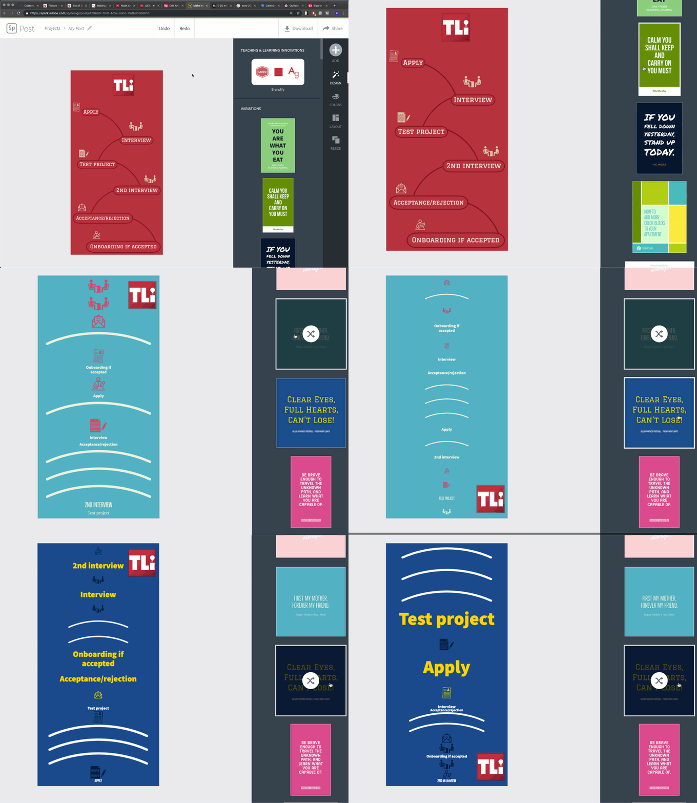
The “Design” Tab is where you can edit the entire visual style of your graphic project all at once. You can use the “Variations” Panel in the Design Menu to scroll through available design templates provided by Adobe Spark Posts. By choosing a design, all of your media within the Canvas will be set to the same visual and typographic style automatically based on the design template chosen. Clicking repeatedly on a design variation will shuffle the layout of content in your Canvas based on the design template layout.
Brandify Option
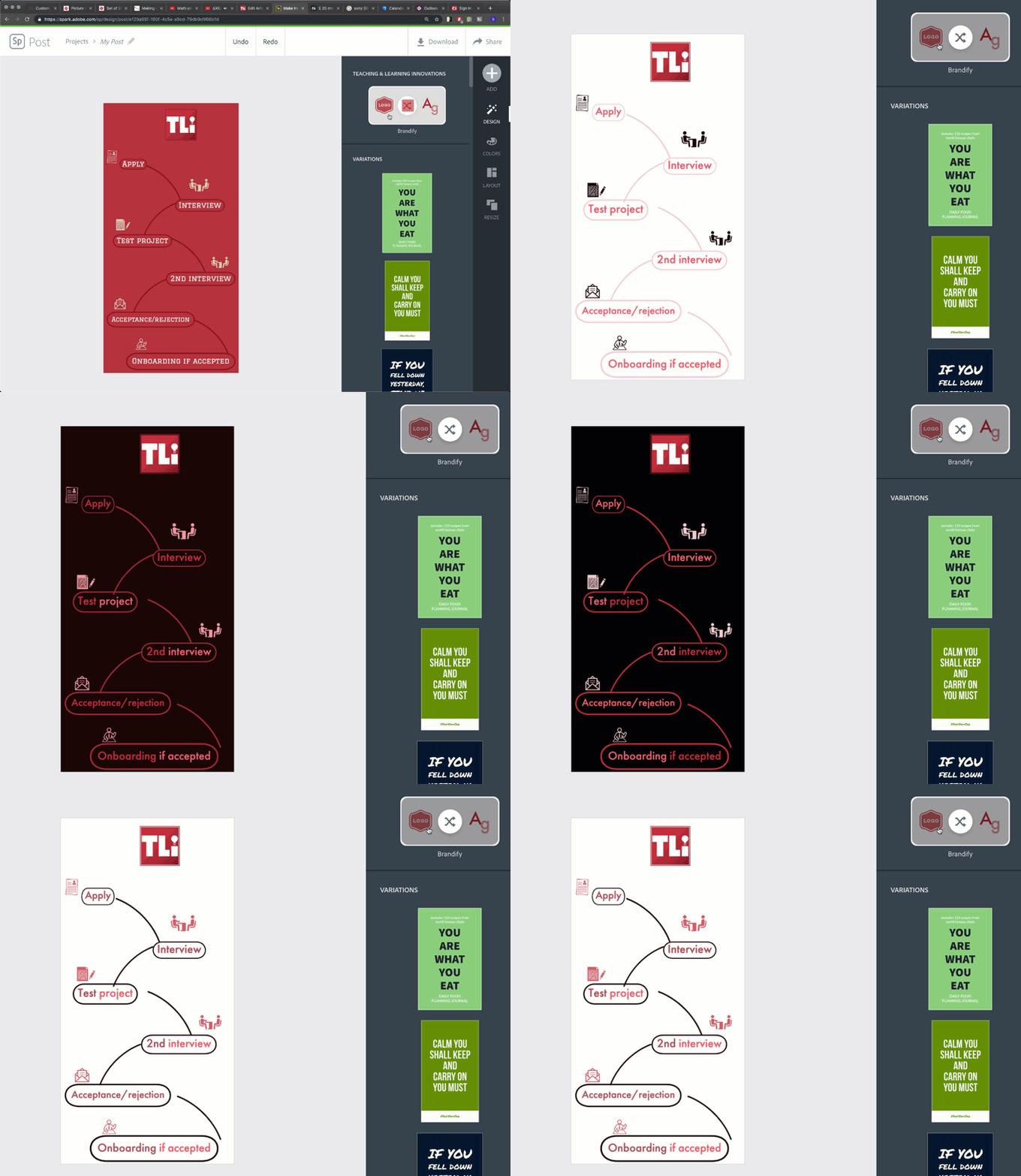
If you have created a brand within Adobe Spark, you can use the “Brandify” Panel at the top of the “Design” Tab Menu to change the design color scheme and typography to that of your brand. Clicking repeatedly on the “Brandify” option will shuffle the colors of your brand to best suit your design needs.
A Note On Changing Designs
Since designs are pre-formatted for specific typographical and pictorial layouts, some designs with rearrange pre-composed media on a Canvas if a design style is change halfway through creation. This will most likely ruin the alignment of custom work done by the user and will have to be fixed after the design change happens.
The Colors Tab

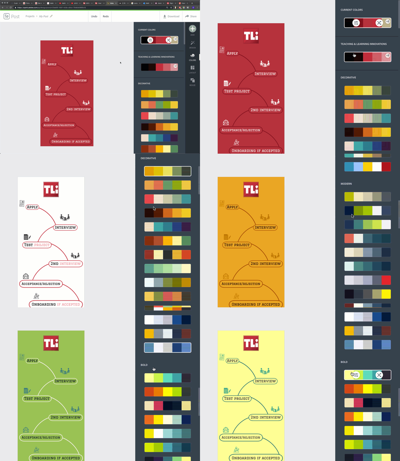
The “Colors” Tab is where you can edit the color palette across your entire project. Color palettes are visual representations of “color schemes” or individual colors that make up a graphic design. The “Colors” Tab Menu is broken up into three separate panels based on palettes; the first panel or the “Current Colors” Panel shows the current color palette of your design, the second panel (which shows the name of your brand) is the color palette for your brand, and the third panel is a list of different color palettes created by Adobe Spark Posts broken up into different “moods” for a design.
Color Palette Modification Options
Clicking on any palette in the “Colors” Tab Menu will change the color palette of your graphic design within the Canvas and bring up the modification options for the color palette itself.
The “Change Color” Option
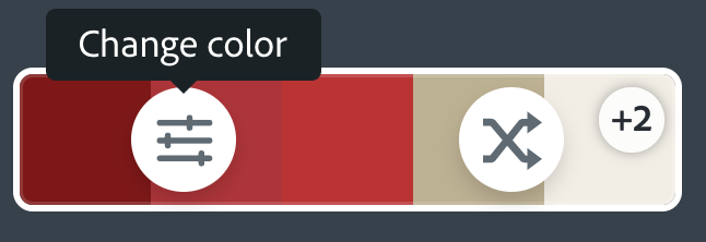
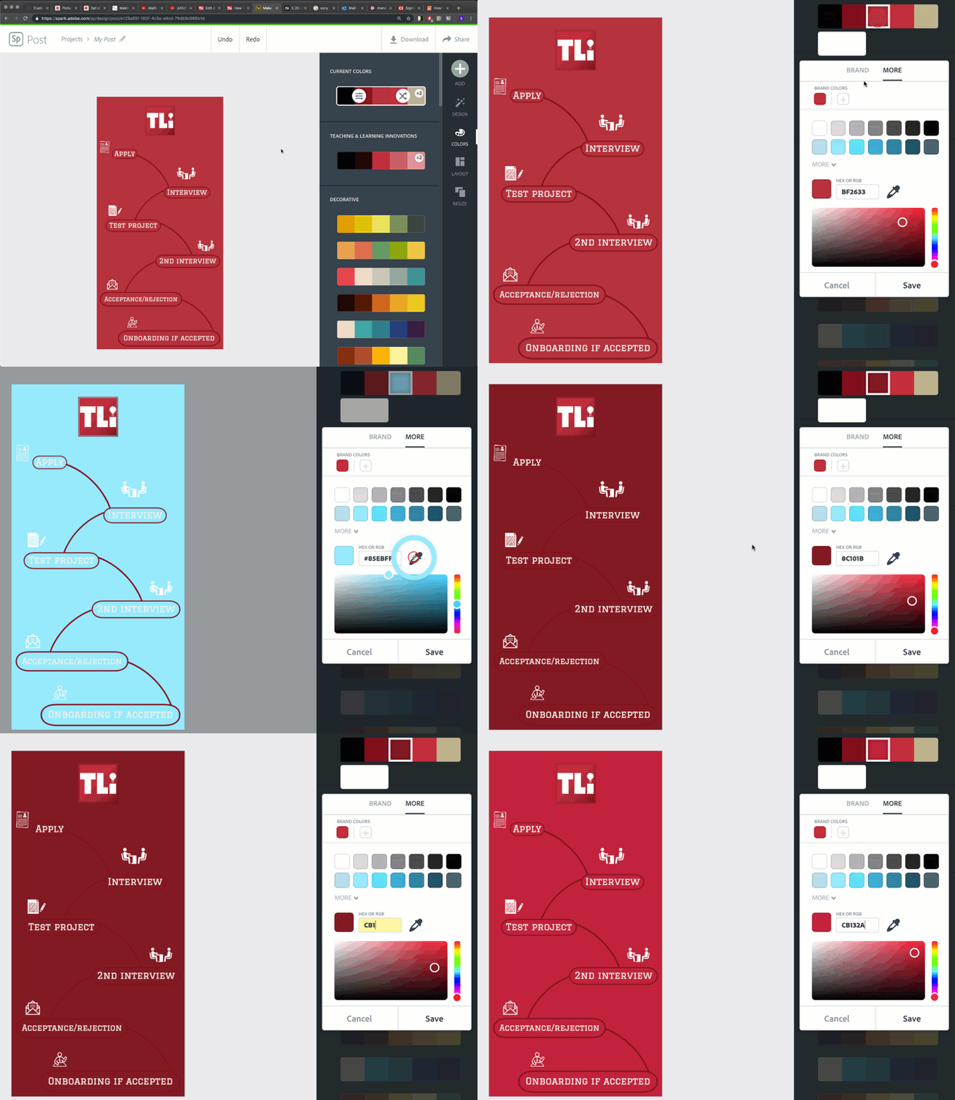
Clicking on the “Change Color” Option will allow you to change each individual color of a palette to best fit your design needs. Clicking on each individual color (as represent by the colored boxes) will bring up a color picker menu that will allow you to change a color by a visual color graph or suggested color boxes, a “eyedropper” tool (to select a color that is already in your Canvas) , or by entering in a specific HEXor RGB code.
The “Shuffle” Option
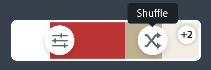
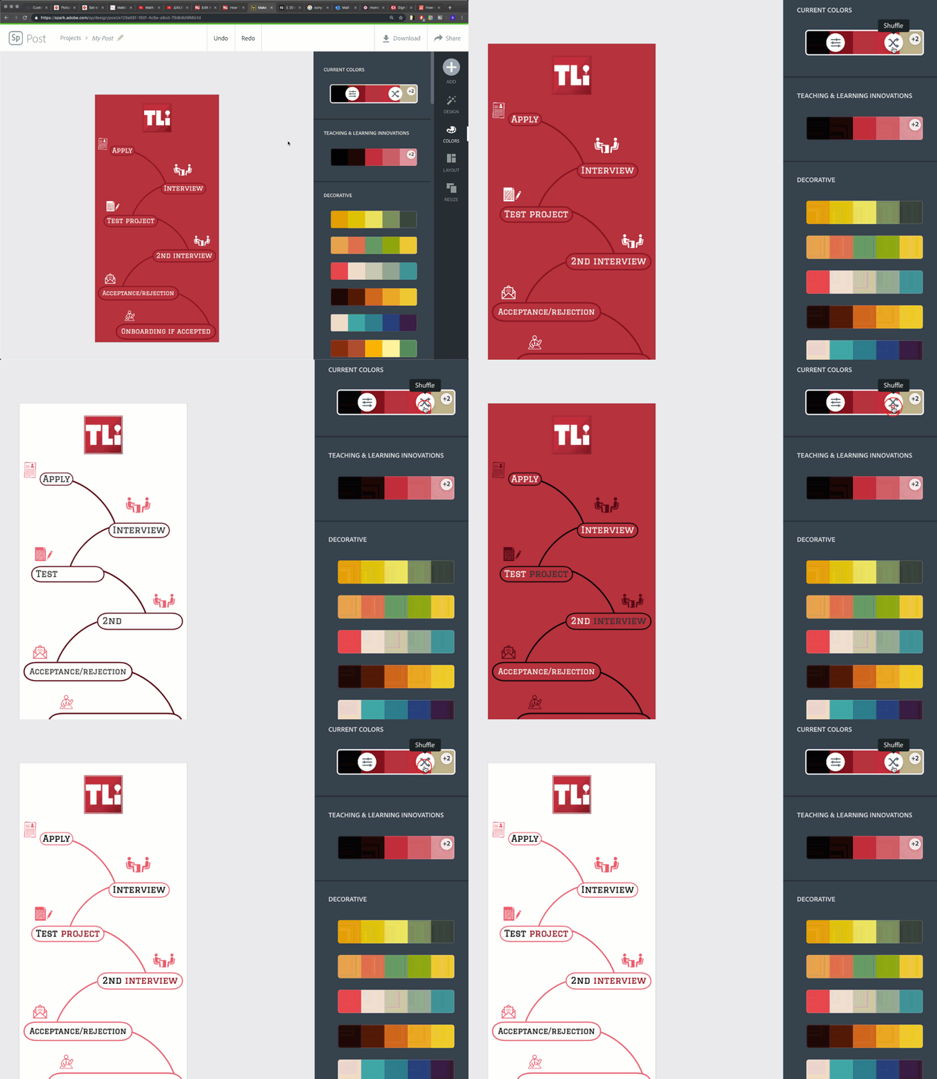
The “Shuffle” Option will rearrange colors based on the current palette of your graphic design within the Canvas. Clicking on the shuffle button repeatedly will randomly assign the colors of the palette to different media within the Canvas.
The Layout Tab
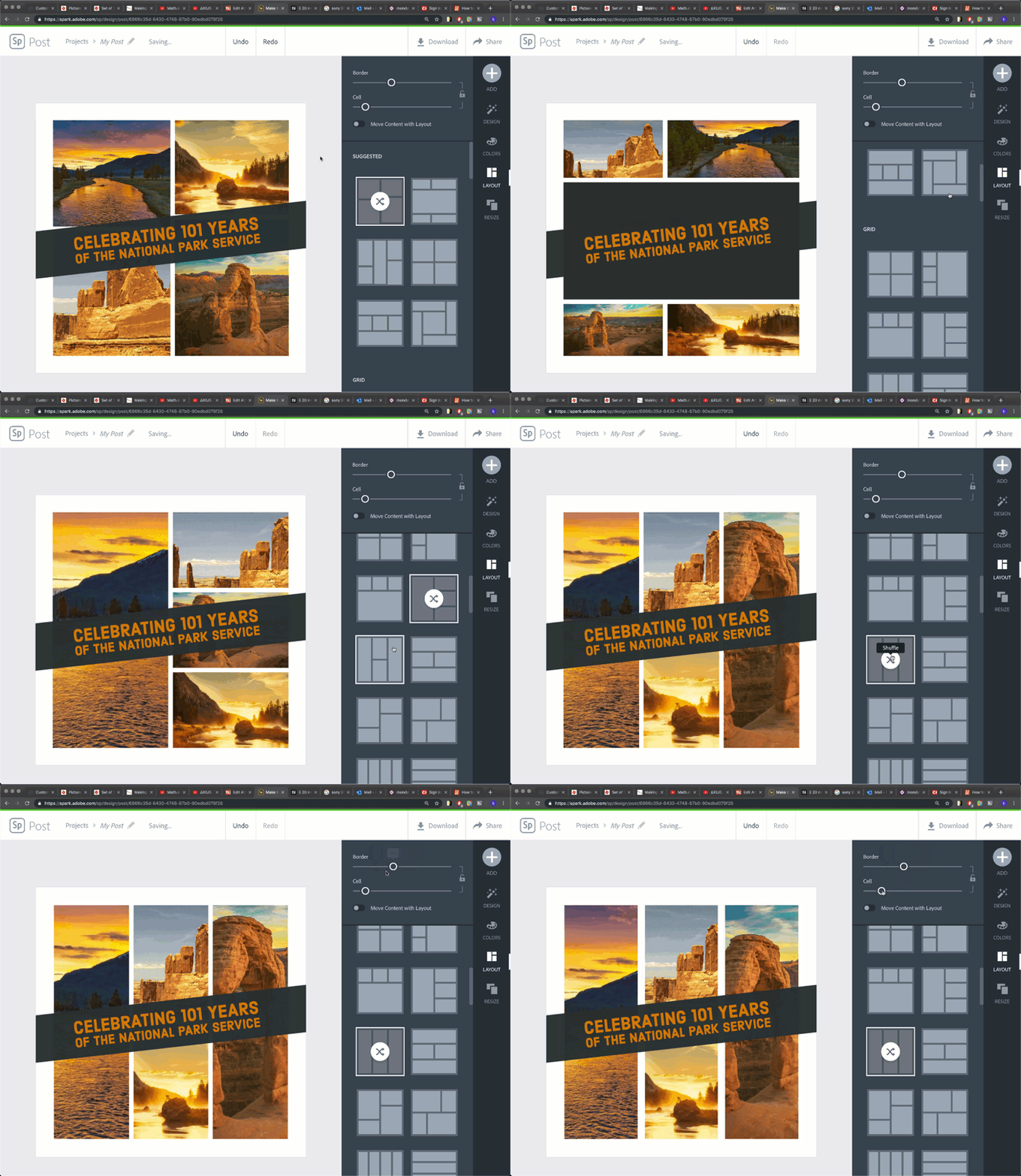
The “Layout” Tab allows you to change the layout of every picture box within a graphic design all at once. The “Layout” Tab Menu allows you to select a picture layout based on templates provided by Spark Posts and provides a way to adjust the boarder and cell size of a picture layout once it is selected. This is also a way to add more picture boxes to your design if the current layout does not have enough to fit the needs of your design.
The Resize Tab
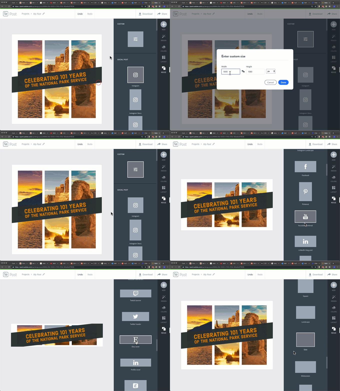
The “Resize” Tab allows you to change the size and shape of your Canvas at anytime during the design process. You can adjust your Canvas by either going to the “Custom” Panel at the top of the “Resize” Tab Menu to enter your own size specifications or choose from a variety of different template sizes on the second panel that are based on popular print and social media standard dimensions.
Downloading and Sharing Your Graphics
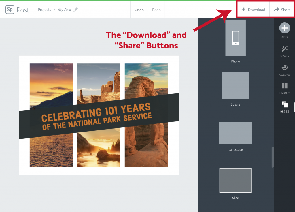
Once your graphic is complete within the Adobe Spark Post Editor, it’s time to share it with the rest of the world. Up in the far right hand corner of the Adobe Spark Post Editor is where you can find the two ways to export your graphic; the “Download” and “Share” Buttons.
The Download Button

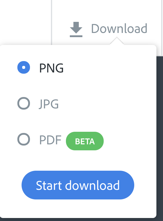
Clicking on the “Download” Button will open up the Format Dropdown Menu which will allow you to convert your graphic into an image file that will be downloaded and saved onto your computer. Currently, you have the option of downloading your Adobe Spark Post Graphic as a .jpg, .png, or .pdf file.
The Share Button

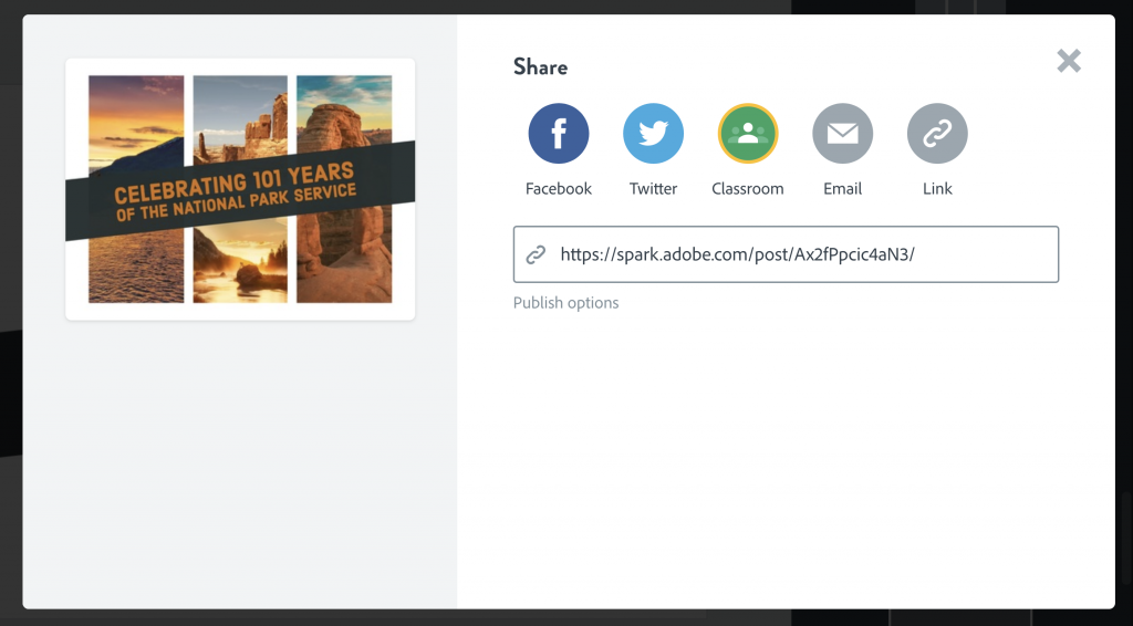
Clicking on the “Share” Button will generate a pop-up window with a link to the graphic you can share out to people who want to view it. This graphic will be hosted on Adobe Spark and you will not need to host it on any other platform if you send out this link. This pop-up window will also provide publishing options if you want to directly share this graphic inside a social media post, Google Classroom, E-Mail, or website without having to use have the picture downloaded onto your computer or mobile device.